What Is Software Delivery Performance?
In the past, software delivery performance was measured based on “outputs” such as code, velocity, and acceleration to name a few. Nicole Forsgren et al, in their book Accelerate: Building and Scaling High Performing Technology Organizations, make a case for why performance needs to be driven by “outcomes.” They outline 4 criteria to measure software delivery performance: lead time, deployment frequency, mean-time-to-restore, and change failure rate.
Besides the above objective measures , there are certain intangibles that impact performance. These intangibles are harder to measure, but not impossible. Google, in its famous research in 2015, after 200+ interviews looking at over 250+ attributes, found that “who is on a team matters less compared to how they interact.” Also, Westrum’s typology of organizational culture is an excellent way to measure such intangibles.
At Harness, we strive for both: measure objective software performance, and periodically keep a pulse on subjective intangibles. Over the past few years, we have been working on disrupting software delivery, one building block at a time – Continuous Delivery, Continuous Integration, Cloud Cost Management, Feature Flags, and more to come! But how does one actually measure it?
How Does One Measure Performance, Quality, and Efficiency?
While the above modules help users build and deploy software quickly and efficiently with the right quality gates and governance, it is equally important to visualize this information, track and benchmark key metrics, and share them with the right stakeholders. We interviewed over 50 customers across various industry segments and sizes, and found the need for measuring software delivery performance to be twofold.
- Engineers/Dev Managers: Want visibility into the metrics that revolve around the services and applications they manage so they can identify bottlenecks, measure outcomes, and improve them over time.
- Executives/CIOs/CEOs: Want visibility into how the organization is performing, benchmark metrics across teams and the industry, and determine the outcomes of their investments in software tools as they scale.
How Are We Enabling This at Harness?
At Harness, we have been working on dashboards that allow you to identify bottlenecks, inform operations, and help drive business decisions. The information and actual metrics may vary based on how engineering teams develop their product.
We decided to do the following to help our customers with the right level of information.
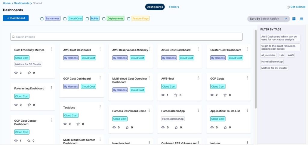
- Offer a library of curated dashboards as part of our upcoming platform update to objectively measure software performance. The DORA metrics covered in the previous section, with the ability to query nearly all of the software inventory and its utilization, are some examples that are made available out of the box.
- While it is impossible to predict all the scenarios our users will want to visualize, it is definitely useful to provide a mechanism for them to be able to build their own. We offer a self-service dashboard creation and editing experience.
Dashboards are available across data that spans all modules – Continuous Delivery, Continuous Integration, Feature Flags, and Cloud Cost Management.
The following are some key capabilities that dashboards supports:
- Curated list of dashboards across all modules to measure software delivery performance.
- Ability to create and edit dashboards with access to key metrics that drive software outcomes.
- Robust reporting with the ability to export data, create scheduled reports, and set alerts.
- Access to the underlying data model to create cross-module dashboards for end-to-end visibility.
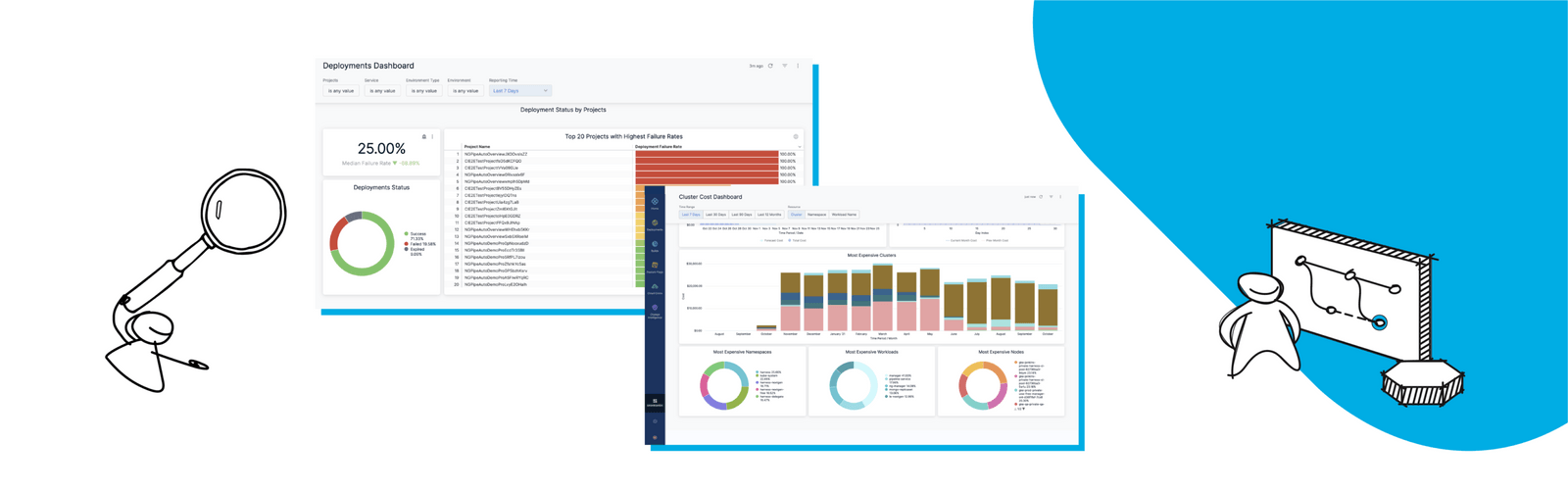
Here are some examples across each module. Each probably deserves a blog post of its own.
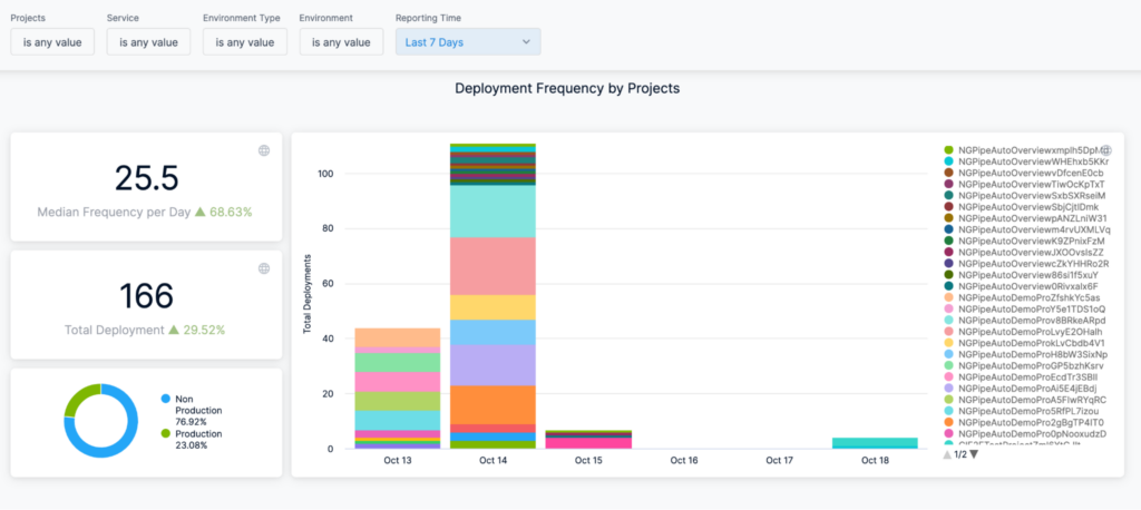
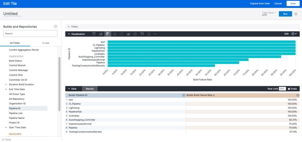
Continuous Delivery:


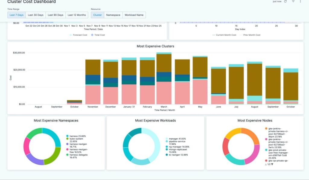
Cloud Cost Management:
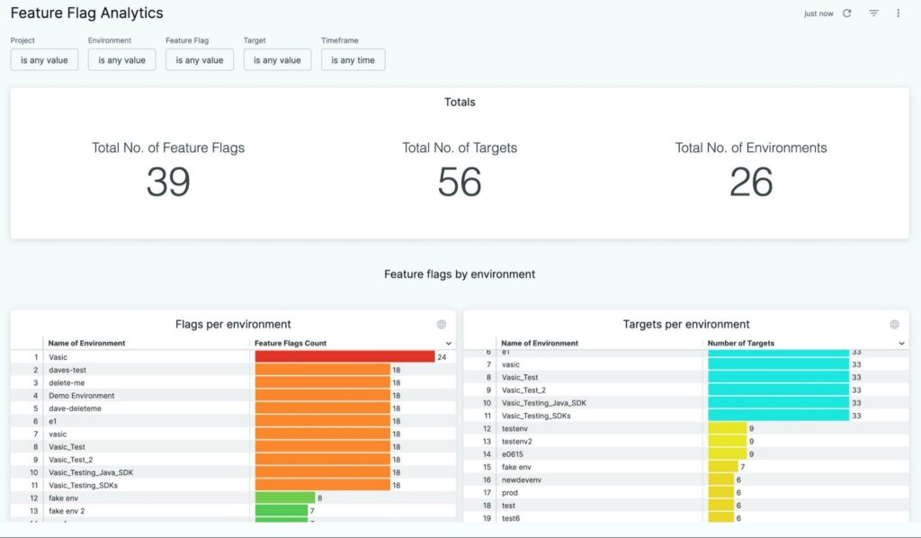
Feature Flags:

Conclusion
It doesn’t stop here! As we continue adding additional modules to the Harness platform, we’ll of course support data for dashboarding. Our goal is to provide end-to-end visibility across all building blocks that constitute a robust software delivery platform.
To see dashboards in action, go ahead and sign up for your Harness account today. If you need some help on what to dashboard, check out our post on Dashboarding. It has a bunch of examples on what’s important to measure.