Analyze performance in a single experience
Our Kubernetes experience curates application and cluster performance data in a new UI, helping you build more performant applications. The new experience provides these capabilities directly within the APM experience:
- A single, curated UI that combines APM and Kubernetes cluster performance data, eliminating the need to navigate between APM and infrastructure monitoring in New Relic to manually correlate data.
- A real-time activity stream that alerts you to Kubernetes events and critical issues.
- One-click logs and side-by-side, selectable metrics to correlate and investigate performance anomalies.
Why developers need to understand cluster performance
Kubernetes has blurred the lines between application and infrastructure. If you’re a developer, your primary focus is on the application and not the cluster’s performance but the cluster’s underlying components can have a direct impact on how well your application performs.
Most monitoring tools silo application data from infrastructure signals. That doesn’t work in Kubernetes environments. Our new experience integrates these areas so you can easily understand how Kubernetes infrastructure affects your apps. These UI changes make it easier to view the entire landscape of your telemetry data and work together across teams.
Correlate performance between apps and clusters
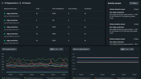
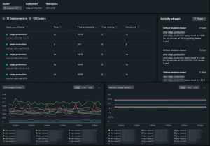
Whether you’re troubleshooting or optimizing performance, the ability to identify all the underlying components and see how they’re performing is critical, especially if you’re deploying workloads with multiple clusters. With our new Kubernetes experience in application performance monitoring, you can understand how cluster performance impacts your applications. Because we link the metadata of all of your entities, you’ll see the workloads, deployments, daemonsets, pods, and hosts that your clusters are linked to.
For example, when latency exceeds acceptable limits, you might find that memory utilization is too high and pods are being killed because they are out of memory (OOMKilled) due to insufficient cluster resources. With our new UI changes, you’ll see this behavior in the pods and containers summary as well as in the activity stream.
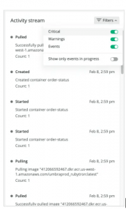
The activity stream helps you understand the relationship between your cluster’s performance and cluster events. As apps are deployed, these important events help you understand how they interrelate to cluster performance, and ultimately, application performance. Additionally, we provide the opportunity for you to filter events so that when problems arise, you can focus on what matters most.
Investigate anomalies faster
Investigating anomalies can be difficult, which is compounded when relevant data is scattered among different UIs, or worse, among different tools. That’s why we’ve prioritized giving you access to all the information you need in one place. In addition to performance metrics that you’d expect, such as CPU, memory, network, and storage, you have access to relevant logs so you can see what’s driving performance changes. We added metadata that links your logs with your related Kubernetes telemetry data, such as errors or cluster performance data, so you can home in on exactly the right data to understand what’s affecting your application’s performance.
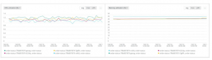
And when you want to correlate performance across metrics, use the charts at the bottom of the page. To analyze how they’re correlated, simply choose between any two metrics in each chart’s dropdown, including average, max, and p95. Because these charts are built using NRQL, you can open up these pre-built queries in a separate query builder to go beyond these charts and ask questions about your data.
You can select from these metrics:
- CPU usage (cores)
- CPU utilization (%)
- CPU throttling (%)
- Memory usage (bytes)
- Memory utilization (%)
- Network received (KBps)
- Network transmitted (KBps)
- Network errors (per second)
- Storage usage (bytes)
- Storage utilization (%)
- Container restart count

Get started today
Our new Kubernetes experience is now available to all full platform users. Get started today by navigating to APM, and on the left-side navigation, select Kubernetes